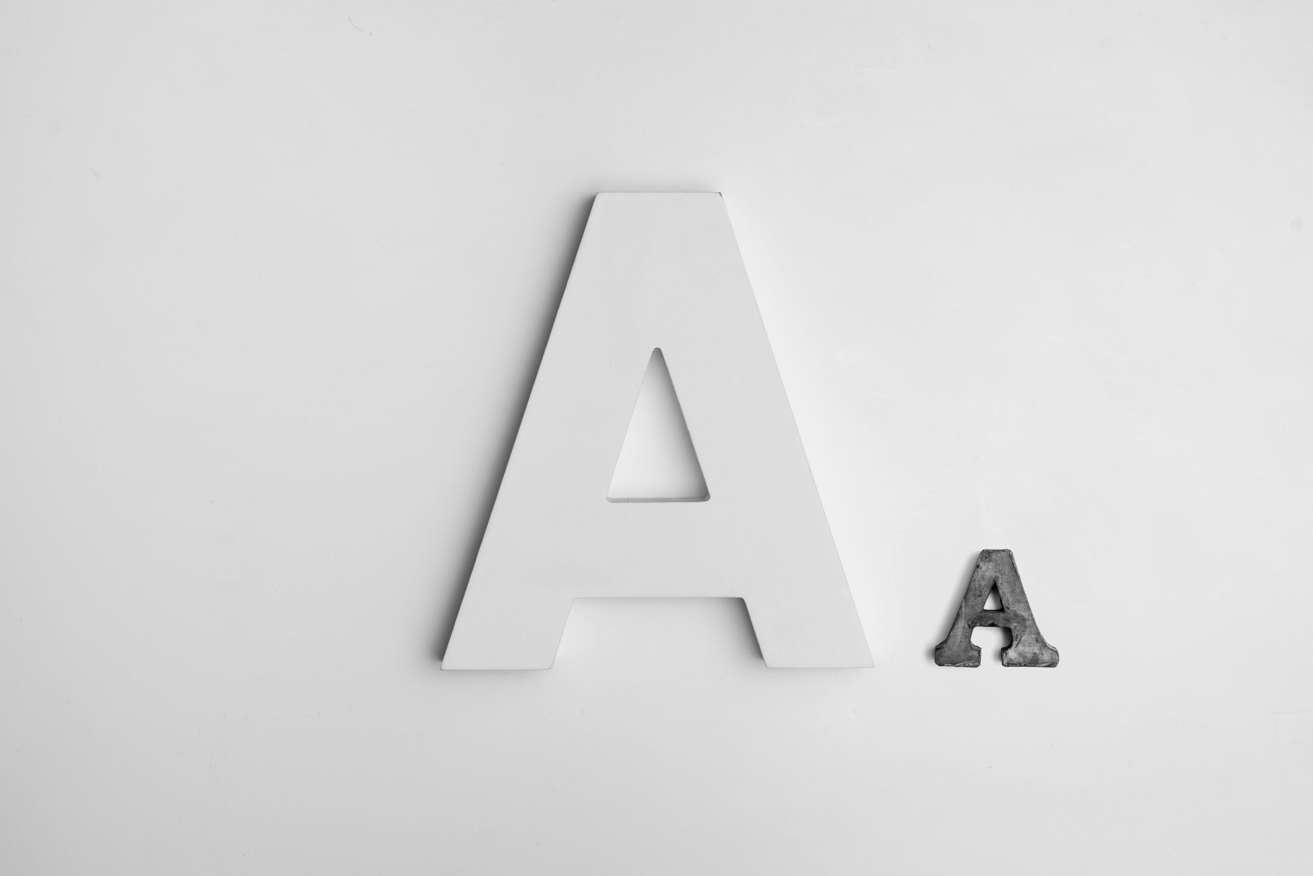
The Art of Typography in Web Design: Impact, 10 Techniques, and Examples
The Art of Typography in Web Design arranging type, plays a pivotal role in web design. Beyond merely displaying content, typography contributes to the overall aesthetics, readability, and user experience of a website. In this comprehensive blog, we’ll delve into the significance of typography in web design, showcase examples of effective typographic choices, and explore various techniques to enhance your design.
The Significance of Typography in Web Design
The Art of Typography in Web Design extends beyond selecting fonts; it encompasses font choices, spacing, line height, alignment, and more. Here’s why it’s crucial:
1. Visual Aesthetics: Typography sets the tone for your website’s visual appeal. It reflects your brand’s identity and can evoke emotions that resonate with your audience.
2. Readability and Accessibility: Well-chosen fonts and appropriate font sizes enhance readability, making your content accessible to all users, including those with visual impairments.
3. User Experience: Proper typography guides users through your content, making it easier for them to engage with your website. It creates a hierarchy that directs attention to important elements.
4. Branding and Consistency: Consistent typography builds brand recognition. It establishes a visual language that users associate with your brand.
5. Communication: Typography conveys more than words. It communicates the website’s style, personality, and the intended message.
Examples of Effective Typographic Choices
- Apple: Apple’s website uses clean and minimalist typography that aligns with its brand image. The font choices are easy to read, and the typography maintains a balance between aesthetics and functionality.
- Medium: Medium employs a unique serif font that adds a touch of elegance to its content. The typography complements the platform’s focus on quality writing.
- Airbnb: Airbnb’s typography is clean and modern. The use of ample white space and a consistent sans-serif font enhances the user experience by creating a sense of clarity and simplicity.
Techniques to Enhance The Art of Typography in Web Design
- Font Selection: Choose fonts that align with your brand identity and content. Consider readability and versatility across different devices.
- Hierarchy: Create a clear typographic hierarchy using font sizes, weights, and styles. This guides users through content, emphasizing important information.
- Contrast: Contrast between fonts helps establish hierarchy. Pair a bold headline font with a more subdued body font for a visually pleasing contrast.
- Whitespace: Ample whitespace around text improves readability. It also gives your typography room to breathe, making the content less overwhelming.
- Line Length and Spacing: Optimal line length (50-75 characters) and line spacing (1.4 to 1.6) enhance readability. Use appropriate margins and padding for a comfortable reading experience.
- Responsive Typography: Implement responsive typography that adapts to various screen sizes. Use relative units like ems or rems instead of fixed units like pixels.
- Avoid Too Many Fonts: Limit the number of fonts to maintain consistency. Two to three fonts (header, body, accent) are usually sufficient.
- Consider Accessibility: Choose fonts with clear distinctions between characters to ensure accessibility for all users, including those with visual impairments.
- Custom Typography: Consider using custom fonts to create a unique identity, but ensure they are legible across devices.
- Test and Iterate: Regularly test typography on different devices to ensure it looks and functions as intended. Make adjustments based on user feedback and analytics.
In conclusion, The Art of Typography in Web Design isn’t just about selecting fonts; it’s a powerful tool that shapes how users perceive and interact with your website. By carefully considering font choices, hierarchy, spacing, and responsiveness, you can create a visually appealing and user-friendly web design that effectively communicates your brand’s message. Just as a well-chosen typeface can elevate a printed publication, thoughtful typography can elevate the entire digital experience. Remember to subscribe to my LinkedIn Newsletter and check my blog post on 6 Best Free Website Builders to Explore in 2023.